What Is Data Residency—and Why Does It Matter?
SAP Business OneAs more organizations move critical systems to the cloud, questions about data residency are...

February 05, 2019
Blog > SAP Crystal Reports: Working with Graphs
SAP Business One Crystal reports empower users to create standard or customized reports from real-time data to improve your planning and audit review processes. But for the times that you’re deep in numbers, it’s also beneficial that these reports can be further customized with charts and visuals aids. These graphics help managers easily digest live data at a glance – meaning you can still interact with the charts and dive deeper into the numbers. Today, we’ll look at how you can easily insert charts and graphs into your reports.
While the process of inserting a graph into your report is simple, it first requires a little bit of setup to ensure that you can access the right information from SAP Business One to use as the basis of the graphics.
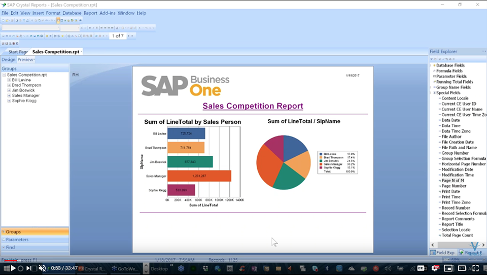
Below is a picture of a typical report made with SAP Crystal reports using the designer. On the first page is the report header. Here you’ll see two graphs that have been inserted into the header: a bar graph and a pie chart. Both are accessing the same data set and presenting it in different ways. Because this report supports groups, if you were to click on the data in the bar graph, it will open another tab in the report designer that goes into more detail about, in this case, a salesperson. Clicking on the graph allows users to move around the report because it’s coming from a group.

Groups are where clusters of data are sorted in meaningful ways in SAP Crystal reports. In this report, we’re looking at groupings of sales people. You can easily jump to an individual sales person by going to the ‘Groups’ menu on the left hand of the screen.
This report also has a drill-down capability, so you’ll see grouping for your sales team, as well as another group for other employees. This allows you to see how much each sales person sold, and how much a customer purchased. Clicking on ‘Customer Name’ in a report will then send you a level deeper into detail about line items for the company. When there are more than one group and one customer, you can use the menu on the left to navigate directly to the associated information.
If you were to print the report, you’d see the header, then the groups by salesperson and a group for customers. At the end of the report, you’d get a grand total on a separate page.
Starting with SAP Business One, users will first need to use queries in SAP Business One as the basis for the report you create in SAP Crystal Reports. For today’s example, the query used is ‘Items Invoiced’. It includes detailed rows of the invoices, document number, sales invoice, and the customer name. The benefit of a query is that it is more efficient and gives the report a longer shelf life.
Once you’ve copied the query from SAP Business One, you can open SAP Crystal Reports designer to enter the query. Start by going to the menu and selecting File>New>Blank Report, and then create a new connection using SAP Business One special connection to your database.
In the ‘Add Command to Report’, you can paste the copied SQL query from SAP Business One, then click ‘OK.’ Now in the field explorer, under Database Fields, you’ll see all the commands that were in the query in SAP Business One.
Under page setup, you can change the orientation of the report to landscape, which will be advantageous to provide your charts with more horizontal space to work with. Now put important content in the details row including document number, item code, and item description, quantity, line total, and the posting date. From the menu bar clicking View>Print Preview will provide a quick look at what you’ve constructed so far.
The next thing to do is insert groups. Go to the main menu, a click Insert> Insert Group. From the drop-down menu, select ‘SlpName’. When the report is later printed, the records will be sorted and grouped by the salesperson name. Users will now note that under ‘Field Explorer’, the ‘SlpName’ is listed under ‘Group Field Names’. Repeating this process for customers’ name will also propagate them to the ‘Field Explorer’ and add group footers in the design preview. Looking at the ‘Quantity Field’ in the ‘Details’ row, right-click>Insert Summary, then add ‘All Group Levels’ and choose ‘Sum’. Then do the same thing with ‘Line Total’.
There’s a lot of formatting that you can do within the designer view. You can alternate between the preview as you adjust the font, bolding, and alignment. The zoom function allows you to more easily control the movement of items on the report. If your report contains too much detail to digest at once, you can go to the main menu, and click Report>Section Expert and select ‘Hide Details’ (drill-down OK). Now when you preview the report, you’ll see the report instantly reflect this change – changing the report from 25 pages to 1 or 2 pages while maintaining the users’ ability to drill-down the information when you want more detail.
Note that to insert graphs you first must decide where you’d like them to go. They can go into the report header, the group header, footer, or the report footer, it’s up to the user. Once more, you can adjust the size of the header or other sections of the report to facilitate charts. Go to the Menu>Insert>Chart and you’ll notice a box outline attach to your cursor. Move your cursor to the report header, and that’s where it will be inserted. While this will get the chart added to your report easily enough, right-clicking on the chart will then allow you to fine-tune its presentation with the ‘Chart Expert’ menu. You’ll notice that you can choose different types of charts here. To achieve the report style in the image above, select a ‘Side by Side’ bar chart and put it in a horizontal orientation.
The subsequent tab of the chart expert enables the user to select data. By default, the report is selecting the groups that you previously set up in the report. If you wanted other fields, there many more options you can select and edit with the Chart expert, but for now, we’ll just keep it vanilla.
If you go to the preview, you’ll see how the chart will look. If you need to make additional edits, go to the ‘Design Mode’ and right click the cursor on the chart to open the ‘Chart Expert’ and make edits from there. If you’re familiar with how graphs work in Microsoft Excel, you’ll recognize some of the features and functions. You can add more charts in the same way as the first, just make sure you have space for it on the report.
SAP Business One gives you the tools to build and deliver compelling reports that provide crucial insights into all parts of your business. For more on how to customize your graphs in SAP Business One, and to access many other useful SAP Business One resources, watch Vision33 TOTAL Care presentation on ‘Working with Graphs’ hosted by Carl Lewis, SAP Business One ambassador.
This resource is hosted in our Vision33 Resource Library. Gain free access to this resource by signing up. You will also have access to Vision33’s extensive enterprise technology library of training materials for SAP Business One. Inside you’ll find ERP tips and tricks, video demonstrations, product brochures, and many more enterprise technology resources. Select from ERP functional areas to expand your knowledge of specific solutions like SAP Business One as you grow your business. Signup today.
Subscribe to our newsletter to receive our latest blog posts, case studies and ERP news delivered straight to your inbox.
As more organizations move critical systems to the cloud, questions about data residency are...
[Updated] Brutos by Vision33 is a cloud-based, all-in-one beverage management solution for...
Vision33 has formal partnerships to resell, implement, and support leading cloud ERP solutions....
Recieve our latest blog posts, case studies, and ERP news
delivered straight to your inbox.