


Jun 23, 2026
Separating Fact From Fiction: What Breweries Should Know About Brutos and SAP Business One
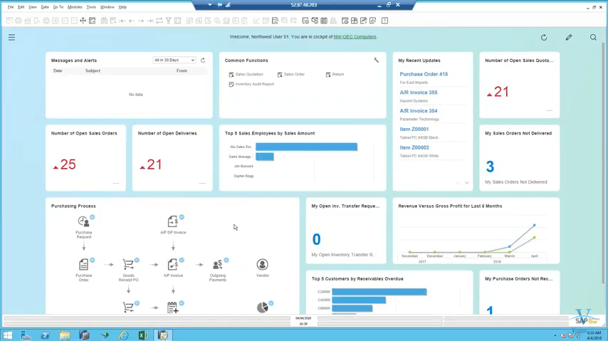
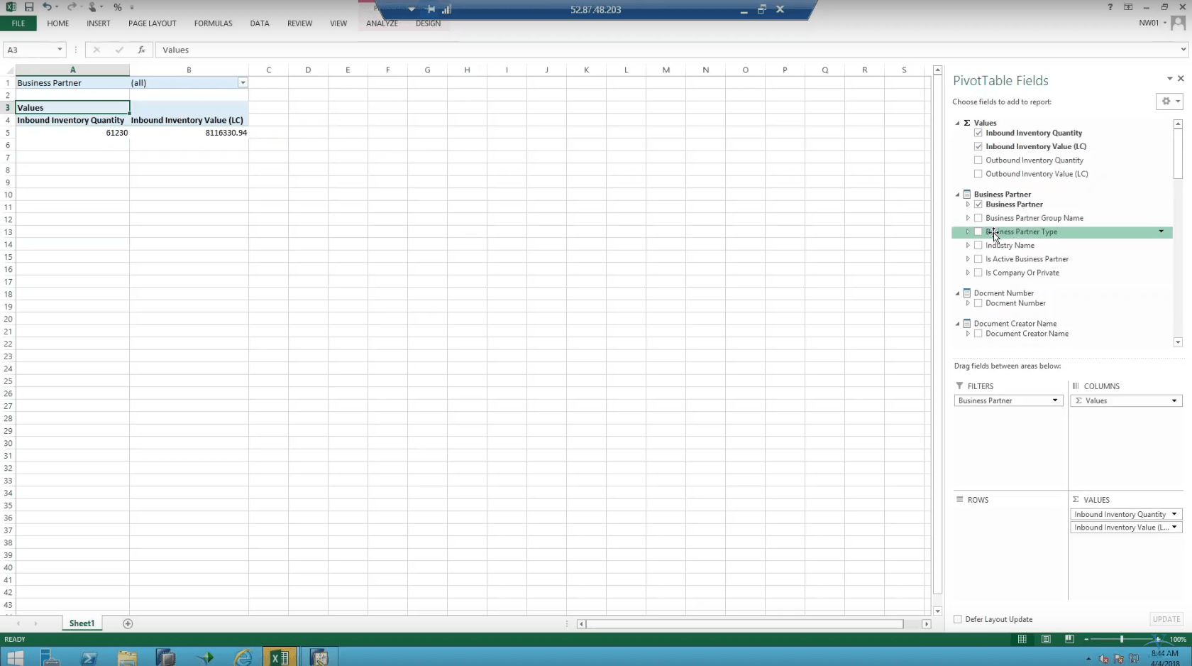
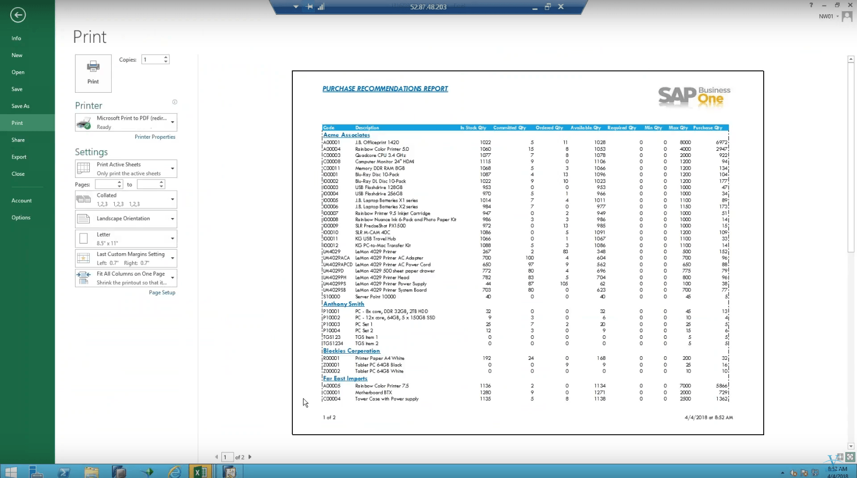
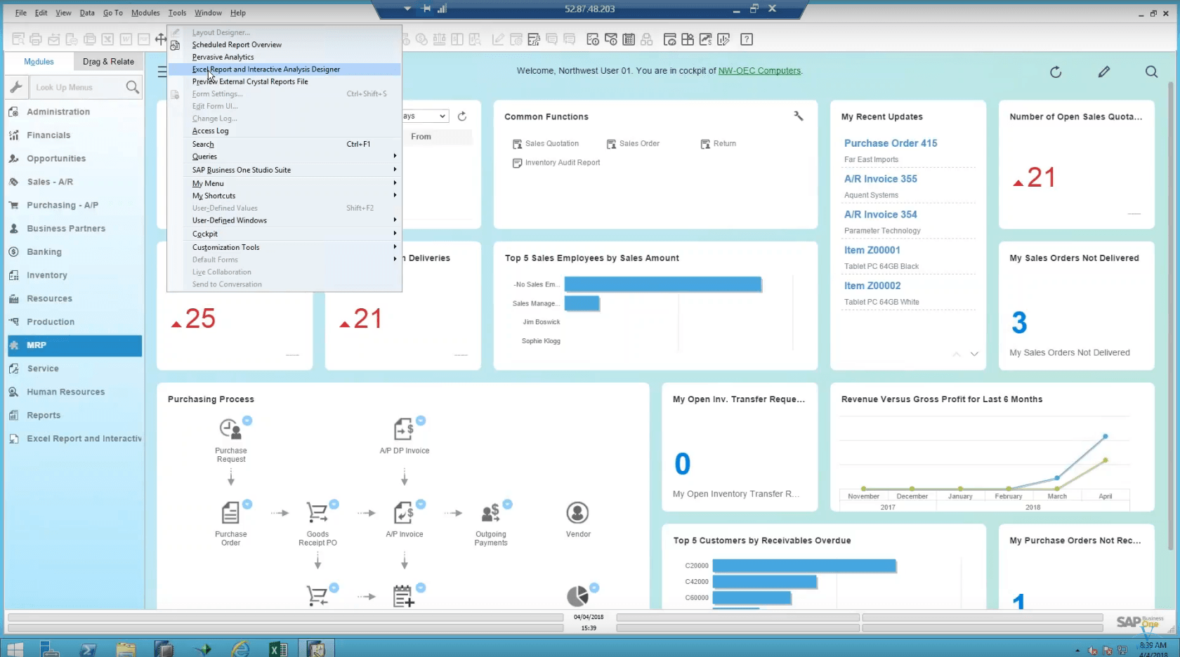
SAP Business OneBrutos is not O’Beer 2.0 and SAP Business One is as strong as ever. Both continue to thrive,...

